

That’s the message from colour experts at Crown Decorating Centres who say that understanding the psychology of colour is a “great starting point” to choosing the right hues for your needs and personality.
After all, what’s home heaven for one is another’s nightmare.
Spokeswoman Kathryn Lloyd said: “As a general rule social spaces suit warmer colours, whereas quiet areas suit cooler, calmer colours to help focus or calm the mind.
“Personality type can determine how a person responds to warm and cool colours. Some may find warm colours overpowering while others may find cool colours cold and unappealing.”
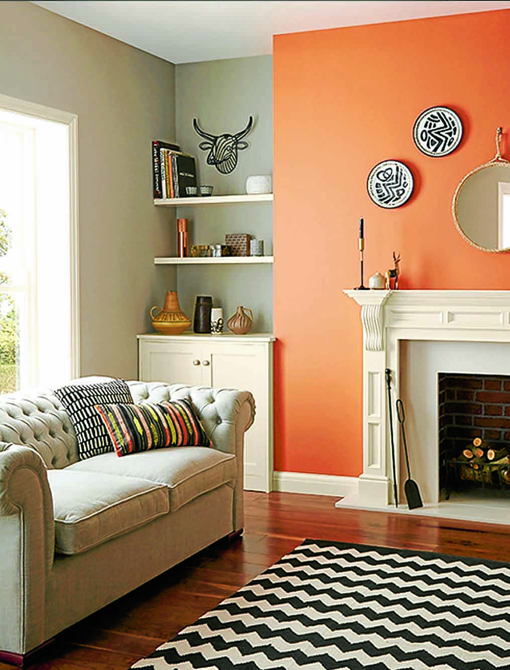
Warm shades, like reds, oranges and yellows, have been known to increase rapid eye movement and blood pressure. They are therefore good for promoting activity, conversation and stimulating appetite as well as being attention grabbing. And they can create a cosy atmosphere, or be used in cold places to warm them up.
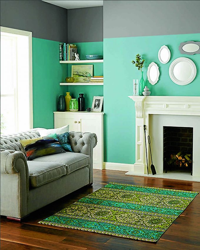
Meanwhile, cool hues, such as blues, aquas and some greys, are calming and therefore often suited to studies and bedrooms, but are not colours associated with food and Kathryn says “not most obvious” choice for dining rooms.
A neutral palatte of white, greys, creams or stones are a great starting point to form the base for a co-ordinated home, especially for anyone lacking colour confidence.
Kathryn said: “A neutral colour scheme is least likely to offend anyone because of its impartiality; colour is an emotional subject and neutrals are a safe common ground. You will often find neutrals used in hotels for this reason.
“Creating interest and adding depth to a neutral colour scheme is simple – just vary the texture and tone of your colours and go to town with textured accessories.”
She added: “If neutrals are your preference, then selecting a range of monotone colours – which come from the same colour group but vary tonally – gives rise to a scheme which is very easy on the eye and can create a soothing effect.”